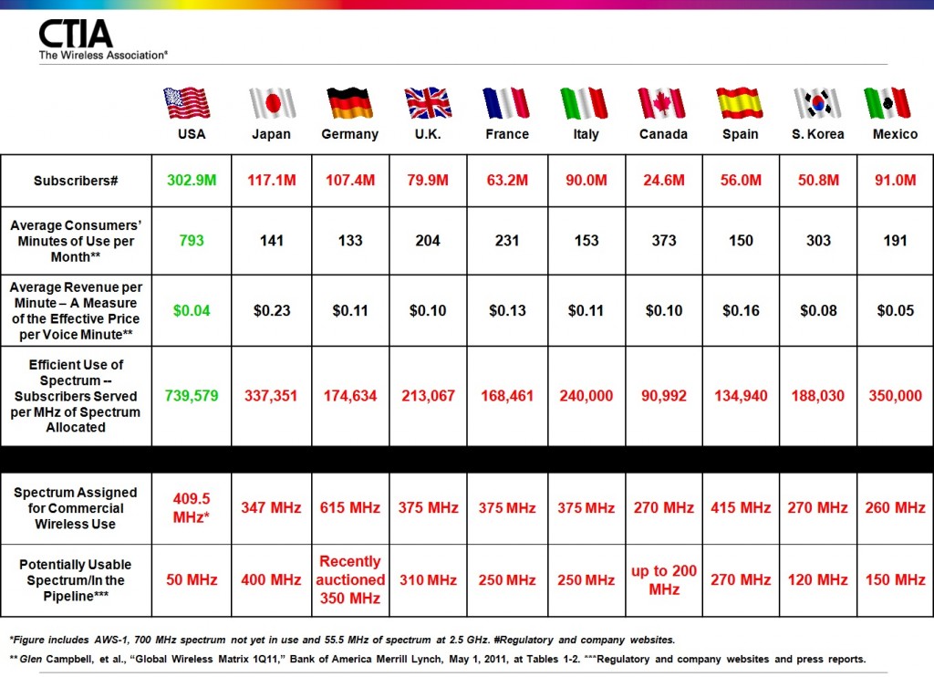
In a recent blog post, CTIA compares some measures of the U.S. wireless industry to those in nine other countries. The purpose is two-fold; to show the U.S. is a leader in number of subscribers, lowest cost per voice minute, and spectrum efficiency, and to argue the need for getting more mobile broadband spectrum in the “pipeline.” These goals are somewhat at odds, and the spectrum-efficiency argument I don’t get, as I’ll explain, but within the constraints of a blog post I think CTIA makes the case that the U.S. is a clear leader in some areas, and that the prospects for more mobile spectrum in the U.S. are fuzzier than they should be today.
Looking at the chart, we see the U.S. has the most subscribers of the countries chosen for comparison (China and India each have about three times as many subscribers as the U.S.). Then we see that the U.S. average revenue per voice minute, which can be considered a proxy for subscriber cost, is 4 cents, the lowest of all countries compared. Very impressive. I’ve seen criticism that this figure may be lower than actual because of a possible assumption that the consumer uses all, and no more of, plan-minutes per month. Even with further adjustments I’d expect the comparison to be favorable. With the growing role of mobile data services, data costs would be a useful to see as well; such a comparison is conspicuous by its absence.
CTIA then positions the U.S. as a leader in efficient use of spectrum, by a factor of two-to-one or more, using “Subscribers Served per MHz of Spectrum Allocated.” Here, they lose me. Cellular spectrum is reused. We are not partitioning the spectrum allocations such that each subscriber has a unique fraction. Though there are many ways to measure spectrum efficiency, and new ones can be created, I don’t see how this qualifies.
We’re back on track with the last two lines showing spectrum allocations and new spectrum in the pipeline. I’m concerned that they are based in part on “regulatory and company websites and press reports.” As we have seen, some press reports are more reliable than others. I’d like to see the specific reference for each figure.
I find it noteworthy that Japan and South Korea, nations with very progressive wireless industries, make do with less spectrum than the U.S. It may be no coincidence that South Korea has one of the smallest spectrum allocations, one of the smallest amounts of spectrum in the pipeline, and has operators that are aggressively deploying Wi-Fi offloading and six-sector base-station antennas, which nominally double spectrum capacity compared to the more-common three sector antennas.
The 50 MHz pipeline figure apparently comes from the National Broadband Plan. There’s been a lot of spectrum policy activity since then, but we’re agreed that there’s little in the pipeline now. In my next post I’ll try to take a snapshot of where we stand with the usual spectrum candidates, and suggest one or two others. Later I plan to review where we are with offloading and other technologies, along with tiered rate plans, that can reduce, but not eliminate, the need for new mobile broadband spectrum.

A better metric to use is MHzPOPs per sub, which allows some accounting for scale (size of country), even though its not perfect. If you look at this figure on an operator by operator basis, you see that US operators generally have a similar amount or more spectrum than competitors in Europe.